Did you know that the human brain processes images in 13 milliseconds?
Our brains are adept at recognizing and remembering shapes, colors, patterns, and other similar visual cues. Technical communication capitalizes on this visual processing strength, to ensure effective understanding of complex topics for the target audience. Especially, in technical writing, these visuals are not just optional elements but strategic tools to ensure powerful communication of technical information. Read on to learn about the importance of visuals in technical writing, different types of visuals and how to create them.
What are Visuals?
Visuals is a broad term representing a form of content that uses a variety of elements combining colors, shapes, designs, and text to convey a message. Broadly, they can be classified into 5 types:
Images
Images come in a diverse range, including screenshots, photographs, drawings, GIFs, infographics, and illustrations. Each image type is suited to represent a particular type of content. For example, drawings are good for explaining structure while screenshots can effectively communicate step-by-step instructions.
Tools to create images:
Tools such as Canva can help you create infographics, drawings, and illustrations with ease. These tools offer templates and customization features to meet your specific requirements. For screenshots, you can use Windows’ pre-built Snipping Tool. Other commonly used tools are SnagIt and FireShot.
Videos
Videos combine visuals with the dynamism of movement, sound, and sometimes even interactivity. This combination creates a captivating experience that draws viewers in.
Tools to create videos:
You can explore several web-based or app-based video tools for your projects. Some of the popular tools are Windows Movie Maker, Camtasia, Canva, and Adobe Express. Also, consider the suitability of the tools to create the video format you want: animated, graphic, recorded, or interactive content.

Charts and graphs
Charts excel at presenting data. There are different chart types each serving specific purposes. For example, Pie charts showcase parts of a whole (often percentages) and bar charts are ideal for comparing categories. Further, line graphs effectively reveal trends and relationships over time.
Tools to create charts:
To create charts and graphs, explore Google Charts, Tableau, IBM Watson, and similar others. To build your desired chart, carefully assess tools based on criteria such as data compatibility, data import/export capabilities, chart variety, and other relevant features.
Diagrams
Diagrams simplify complex information or processes using shapes, arrows, and labels to show steps, connections, and relationships. This makes them easy to understand and follow, like a visual map for ideas.
Tools to create diagrams:
Several free drawing tools like draw.io, are available for Windows and Mac. Paid options like Microsoft Visio and Diagrams.app often give more advanced features and functionalities.
Maps
Maps are powerful tools for visualizing geography. These scaled representations depict locations, routes, and features, accurately maintaining relative distances. Additionally, the color coding enhances clarity, highlighting specific data or features and the text labels pinpoint important locations and landmarks.
Tools to create maps:
Google Maps, Desktop Geographic Information System (GIS), and Power BI are some of the common mapping platforms. Each one of these is suited for specific applications. So, make a list of your requirements and research which tool best caters to your needs.
Advantages of Visuals in Technical Writing
In our daily lives, we often fail to appreciate how visuals contribute to effective communication. But as a technical writer, understanding how visuals ensure better communication helps you leverage them effectively. Here are some of the most common advantages:
Quick
Our brains create internal images of everything we read, write, or even think. When we see an image, the processing time reduces and readers can grasp the content quickly.

Concise
Charts, graphs, and infographics can condense large amounts of data into a single image. This makes identifying patterns, trends, and relationships easier compared to reading tables or long text descriptions.
Clear
Remember those neat, labeled diagrams we studied in textbooks? They helped better comprehension of the description.
Similarly, in technical writing, design diagrams and other visual elements mediate clear and effective communication. They fill the gap in understanding a topic and ensure better comprehension.
Engage
Combining visuals and text creates a more engaging reading experience. While we often skim through text, images have the power to capture attention and encourage deeper engagement. They break up monotonous text, offering a refreshing visual break. Additionally, visuals have a universal appeal, effectively connecting with audiences of all ages.
Impact
Have you noticed how visual advertisements like print and videos make an impression and affect our buying decisions? Similarly, a video tutorial explaining the installation of software can make the learning impactful. It ensures better comprehension and impacts the user’s perception of the product and services.
Long-lasting
Scientific studies have proven that visuals aid memory retention. By using visuals, you can help your audience retain the learning for longer. Further, enhanced retention through visuals translates to better knowledge application and improved information recall during execution.
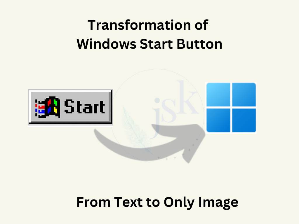
An evident example is the Windows Start button. Microsoft gradually changed this text-based button (in Windows 95) to just an image. We, as users, without noticing the difference have also adopted the change. Clearly, the image part was more lasting in our minds than the text part of Windows 95 Start button.
Simple
Unlike text, visuals transcend language barriers. Consider a simple example of traffic lights. It is easy to understand what the traffic signals green, yellow, and red mean. People can recognize them from a distance and understand the signal, regardless of their linguistic backgrounds.
The visuals in technical writing simplify absorbing complex content through a combination of icons, shapes, motion, and other features.
Quick Tips to Create Effective Visuals
Audience in focus
Like any type of content, it is essential that your audience understands and relates to the visuals. For instance, while professionals prefer clean and straightforward graphics, a younger audience find them boring. They resonate with vibrant and dynamic visuals instead. Hence, when implementing visuals in technical writing, make sure that you create them according to the interest and knowledge-level of your readers.

Simple and clutter-free
While we say visuals convey a bundle of information concisely, do not pack the visuals with excess of content. Too much clutter not only takes away the aesthetics, but also makes them difficult to comprehend for the user. On the other hand, a simple visual conveys your intent effectively.
Consistent style
Consistent style is not just a symbolic of professionalism but also helps you build the trust of the customers. Your consistent visuals are the indirect message for them as they know what to expect from the brand. It increases customer loyalty and boosts retention.
Appropriate graphic
While graphics play an important role in conveying messages, not every visual suits all messages. A screenshot is apt to support a step or display a feature in action, while an infographic is best to present marketing information. Similarly, data is well-presented with the help of charts. So, each visual type has its own benefits. Use them appropriately to make the best use of the visuals.
Mindful frequency
Visuals in technical writing increase comprehension. However, overdoing them can be daunting for your technical content instead. To get the best out of your content, you need to create a balance in the frequency of visuals. Use them only when needed while supporting them with appropriate text descriptions.
Summary
The use of visuals in communication has evolved over the years. In technical writing, various visual elements offer several advantages contributing to improved learning experience and comprehension for the audience. To get most out of your visuals, make sure you use them effectively considering factors such as audience, simplicity, aesthetics and data type. While visuals are powerful, using them alongside well-written text is the key. Using visuals in technical writing creates a dynamic experience for your audience which ultimately contributes to trust and transparency in the product or services.


Leave a comment